
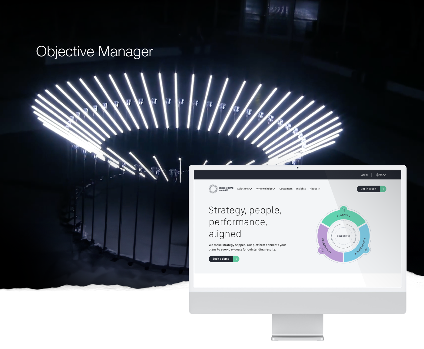
Objective Manager builds SaaS software that aligns planning, performance and engagement. Giving purpose to every person, process and activity within law firms.
Background
In early 2021 I joined the Objective Manager team as one of 2 new UX design hires. Brought in to improve overall usability and help build a new, next generation re-write including much needed self service tooling. Popular in almost all of large UK legal firms there was ambition to break into other global markets. At the end of April 2021 Objective Manager was acquired by Litera.
Objective
To create a new up-to-date design for the product suite and establish a user centred approach for a large re-write initiative. There were also some quick win usability improvements to the Objective Management (OM) software I was involved in. The Objective Manager brand had been refreshed by a London based agency and my overarching brief was to do the same for the product as well as making workflows simpler and the product more intuitive. There was ambition to make the tools more self-serviced to relieve a stretched support team.
My Role
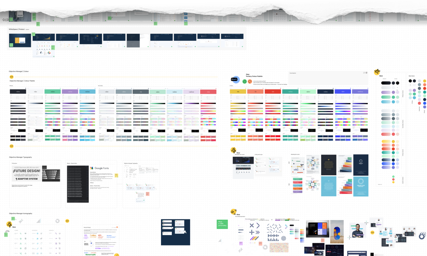
Alongside getting to know the team, business and product, I dived into the OKR space doing a lot of competitor analysis. I also made a start looking at various foundational elements for a small bespoke design system for the product re-write. Colour, Typography, Icons & Imagery but first and foremost finding Objective Managers own Style. While the new corporate identity was strong from a public consumer facing point of view, the colours were not particularly accessible and we needed to introduce a lot more into the product all while staying true to the consumer brand guidelines.
Below is a little snippet of the design research I conducted.
The System
I followed Brad Frost's popular atomic design approach to designing: Atom Components » Molecules » Organisms and then progressing to Layouts/Templates & Pages. I used separate Figma frames for each individual component which meant we could fully leverage the fantastic plugin capabilities across most of our tooling. In Jira we would be able to setup tickets and include each actual component in the ticket from the Figma frame share link. Likewise in our Storybook setup we would be able to include the live component link. From the get go I baked in accessibility and was targeting AA by default with a dial up to AAA.
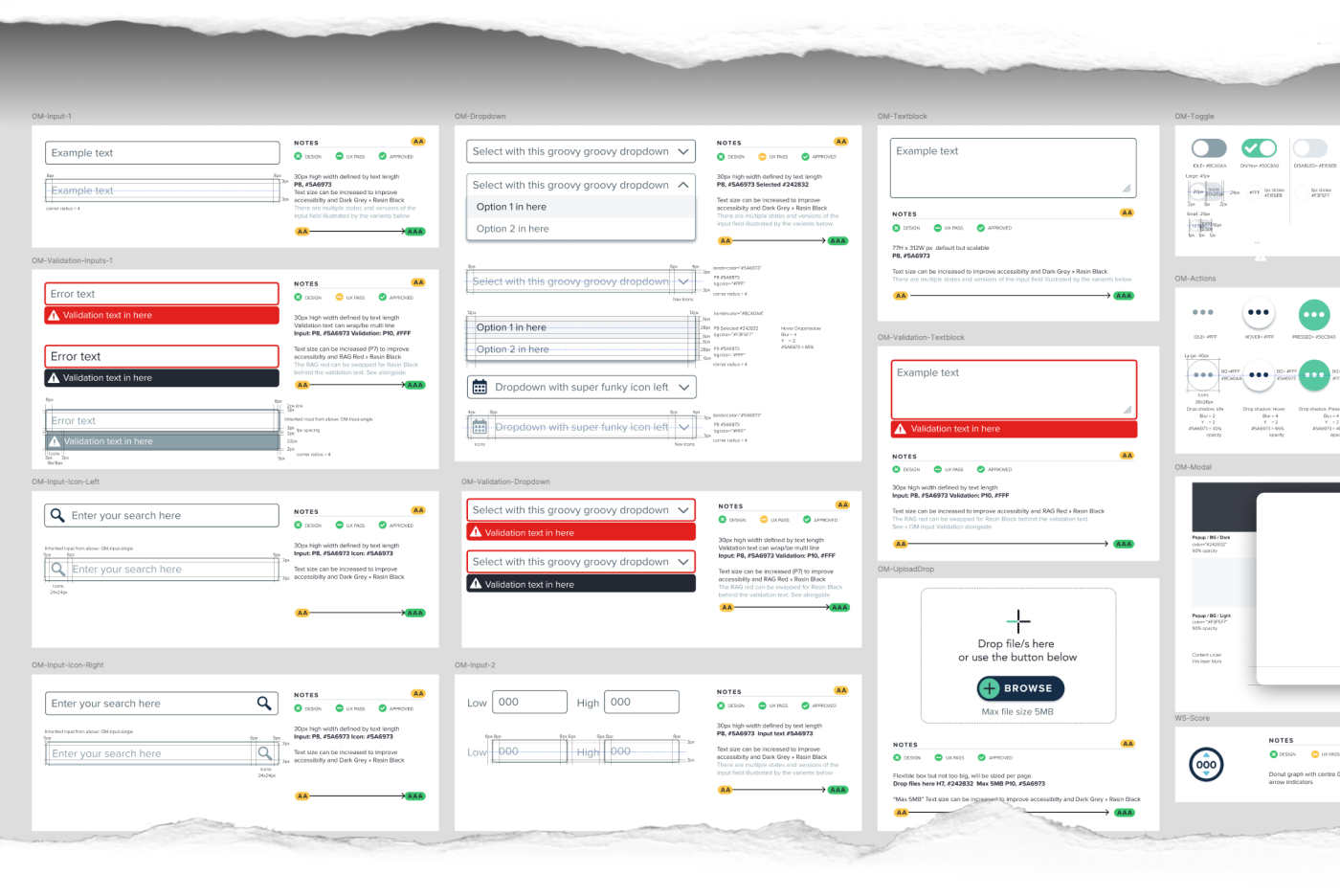
As this was some time before automated documentation plugins like Eight Shapes Specs I included all the necessary specs for our react developers to utilise and help QE to test.
The Quick Fix
Objective Manager ran quarterly CAB (Client Advisory Board) sessions to troubleshoot pain-points and gain high level feedback on the software. The number one pain-point for some time had been the disjointed navigation. There were a total of three separate navigational elements due to multiple updates and additions over time. My talented co-designer Alex Bennett and I ran a number of user sessions and tested some early prototype designs with a variety of users. The feedback was overwhelmingly positive and we pressed on with implementing the updates.
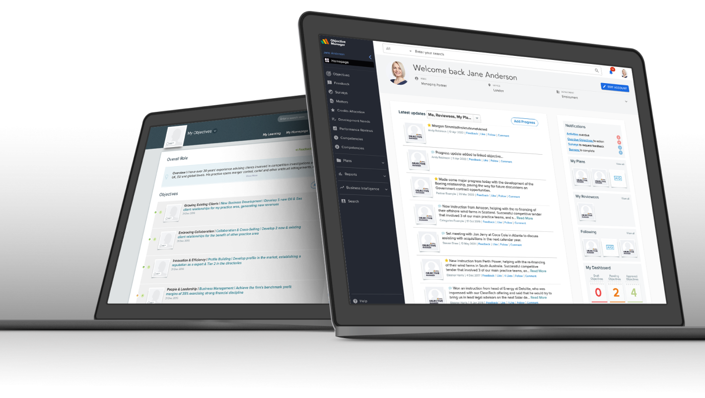
We established multiple common UI patterns across the quick fix redesign. Drawing inspiration from many sources and applications OM users are known to work with regularly. Left hand navigation, provided us with all the flexibility we needed for growth. A consistent top bar with relevant account and notification placements on the right.
Usage data also indicated that the search bar was extensively used in the existing point solution and we exaggerated the length of the input field to make it more prevalent and accessible. We added a category pre-filter to the search and retained the rest of the existing functionality but with updated designs.
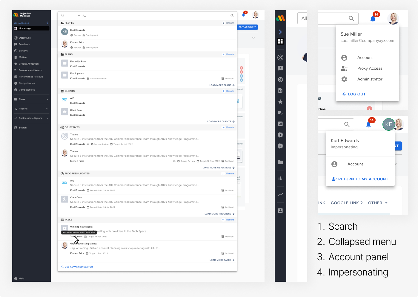
Multiple edge cases were catered for and smaller CSS updates were also done to provide a more consistent and updated design. The development team used a micro frontend approach to the build.
I assisted in creating comms and onboarding material for this large update to the OM frontend. The project was deployed and immediately received rave reviews and feedback from the Objective Manager users.
The Vision
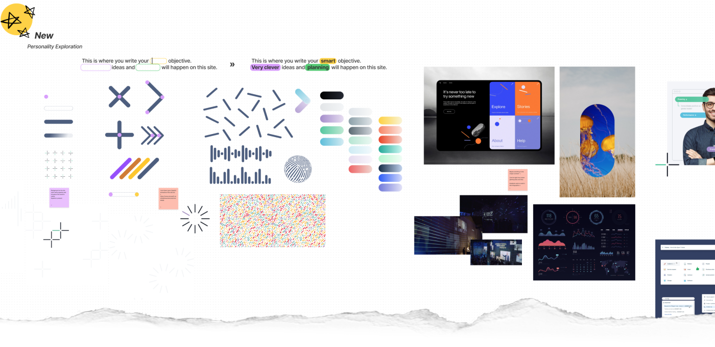
The small design system supplied components to the product for all OM users as well as a back-office self service portal. Some early mock-ups explored the overall design decisions. These designs were tested with internal stakeholders and clients to gain feedback.
Look a like web fonts were used as the headline (H tag) to closely represent the Objective Manager display font in the brand guidelines. FS Industrie » Barlow.
Our choice of font for the bulk of the product was Proxima Nova. A firm favourite due to it's beautiful, versatile design and legibility.
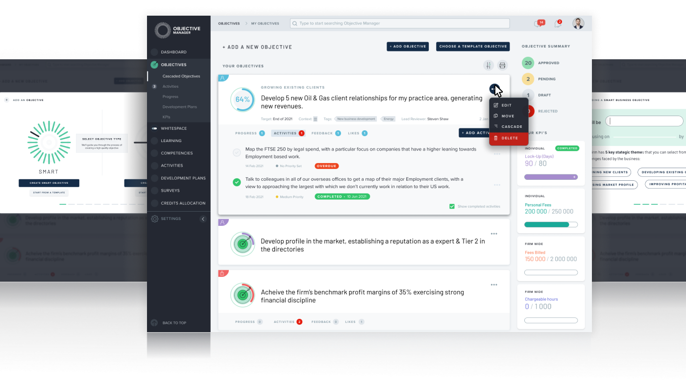
Early back office design explorations reused many of the same design decisions but we clearly differentiated certain components from the regular system. Responsive mobile designs were also created for all of the explorations I designed.

Unfortunately once Objective Manager was sold to Litera the work I had done on this bespoke system stopped. We quickly managed a re-brand of sorts adding the Litera Logo mark and paused all design work on Objective Manager.
