
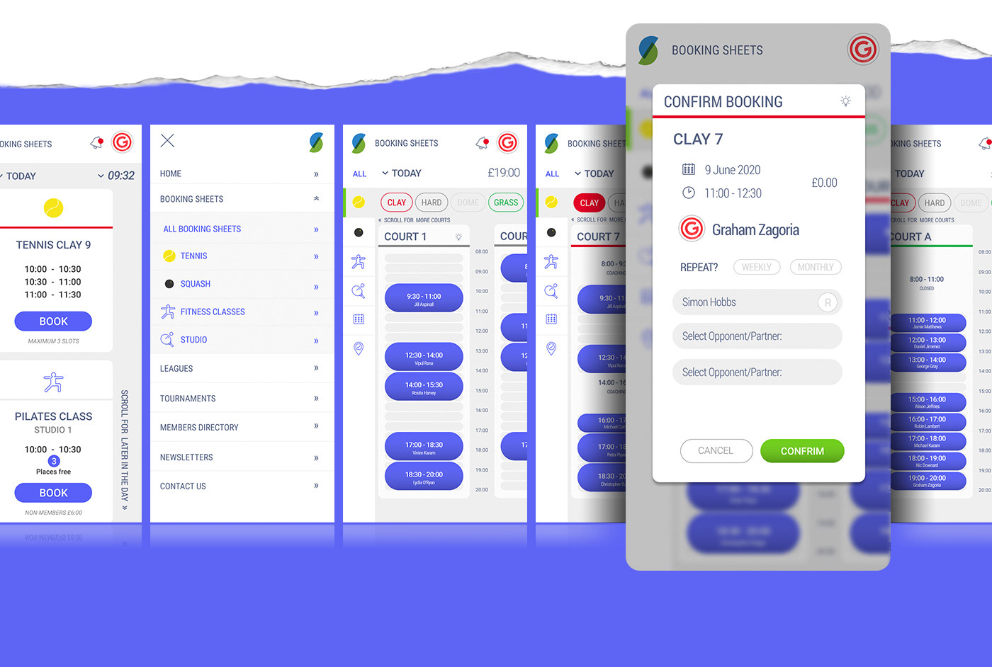
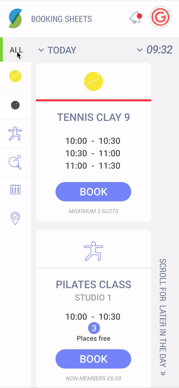
One of my lock-down pet projects, I decided to redesign and improve my local tennis clubs booking tool. The current one, while functioning is dated and purely web-based. My idea was to improve on the usability and design a new mobile app to take full advantage of the extended functionality.
A great passion project.
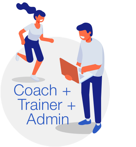
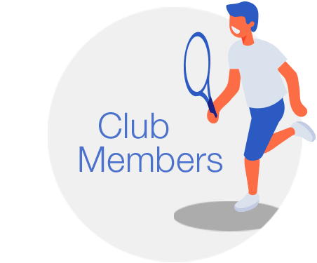
I began simply re-designing but quickly realised it needed a complete overhaul. With full access to all the members and club staff it was a great opportunity to UX the app from the get go. Initial meetings with admins & users were setup and the pain-points quickly revealed themselves. Surveys and prototypes were distributed and new functionality spec'ed.

Some of the user pain-points discovered in "A Day in the Life" exercises are listed below:
Dated user experience, poor on mobile.
No overall dashboard view.
Multiple/Repeat bookings process is poor.
No integrated “selling” of coaching/training.
No cancellation/no-show process for trainers.
Refund/crediting users account is difficult.
No personalisation/customisation options.
Overall lack of automation.
No overall dashboard view.
Multiple/Repeat bookings process is poor.
No integrated “selling” of coaching/training.
No cancellation/no-show process for trainers.
Refund/crediting users account is difficult.
No personalisation/customisation options.
Overall lack of automation.
Below is some of the feedback I received from fellow members at the club and some of my personal pain-points identified while using the system.
Dated, web based user experience.
Prospective bookings and cancellation numbers are high.
No integrated messaging or communication.
Fines, and fees are often confusing.
No personalisation/customisation options.
Overall lack of automation and app functionality.
Prospective bookings and cancellation numbers are high.
No integrated messaging or communication.
Fines, and fees are often confusing.
No personalisation/customisation options.
Overall lack of automation and app functionality.
Further criticisim was around the booking process relying too heavily on alternative apps and methods of communicating. Booking a doubles match could look something like this:
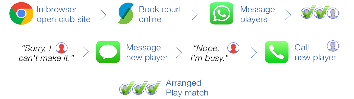
Communication within the app would streamline and simplify this process. Multiple players could be added to a booking and the 1st player/s to respond would secure their place. Once the court and competitors were confirmed, automatic notifications would be sent out.
Further discussions with the club management revealed issues around multiple prospective bookings and no-shows. With this in mind I suggested a reservation method of booking to be added beyond the 2 week booking window. This is a feature they are keen to explore in a user testing phase.

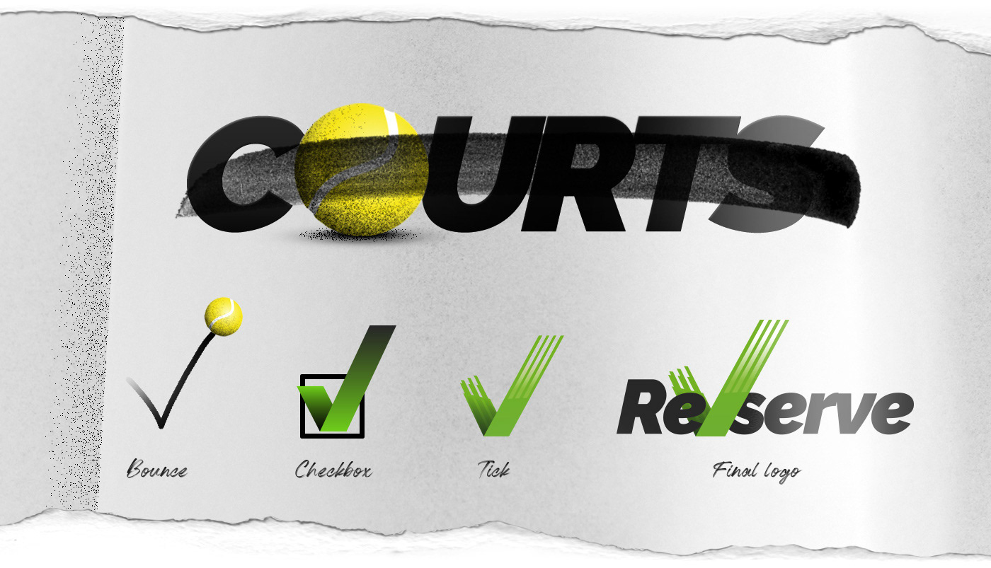
Courts was more of an early working title. A branding re-think ended with the more generic name of Re-serve. Software as a “serve”ice.
For the logo I explored the act of booking itself. I played with the movement of a ball bouncing, a checkbox and the positive tick logo mark was an obvious choice.
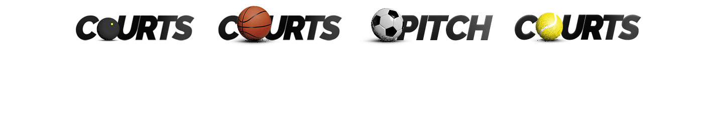
The previous branding exploration won’t be lost and can feature as supportive imagery for the different target areas Re-Serve is applicable in.

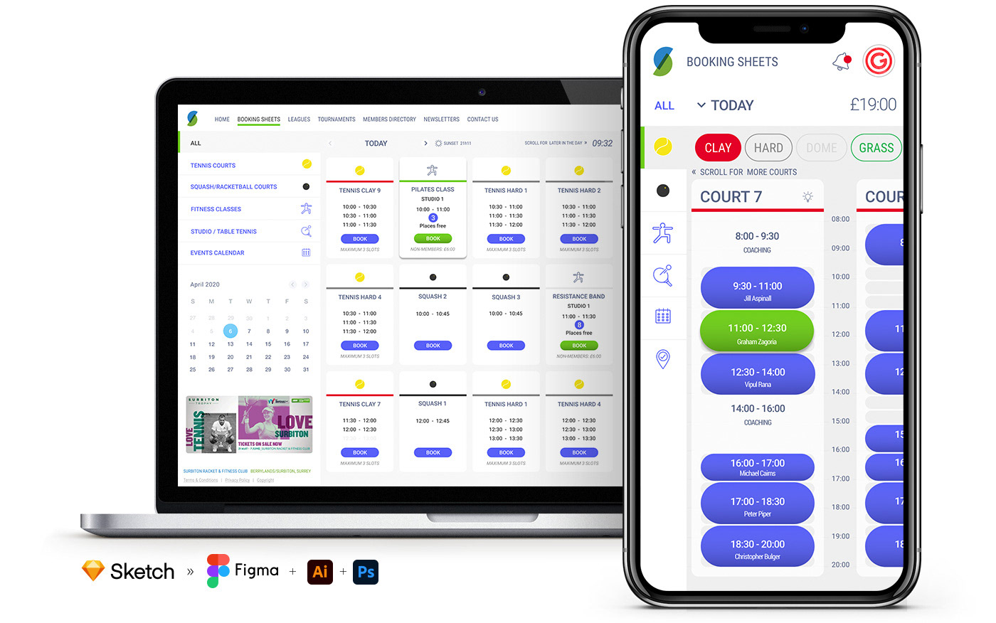
I have set up a design system for the build in Figma which I am evolving with the project. While the end objective is for a native mobile app, our MVP is to build it out as a responsive web app to replace and greatly improve what is currently being used.
I have adopted a modular scale approach, which Tim Brown introduced, back in 2011, in a great A List Apart article “More meaningful typography”. Based on the Fibonacci golden ratio it dictates all my spacing, text scale and viewports.
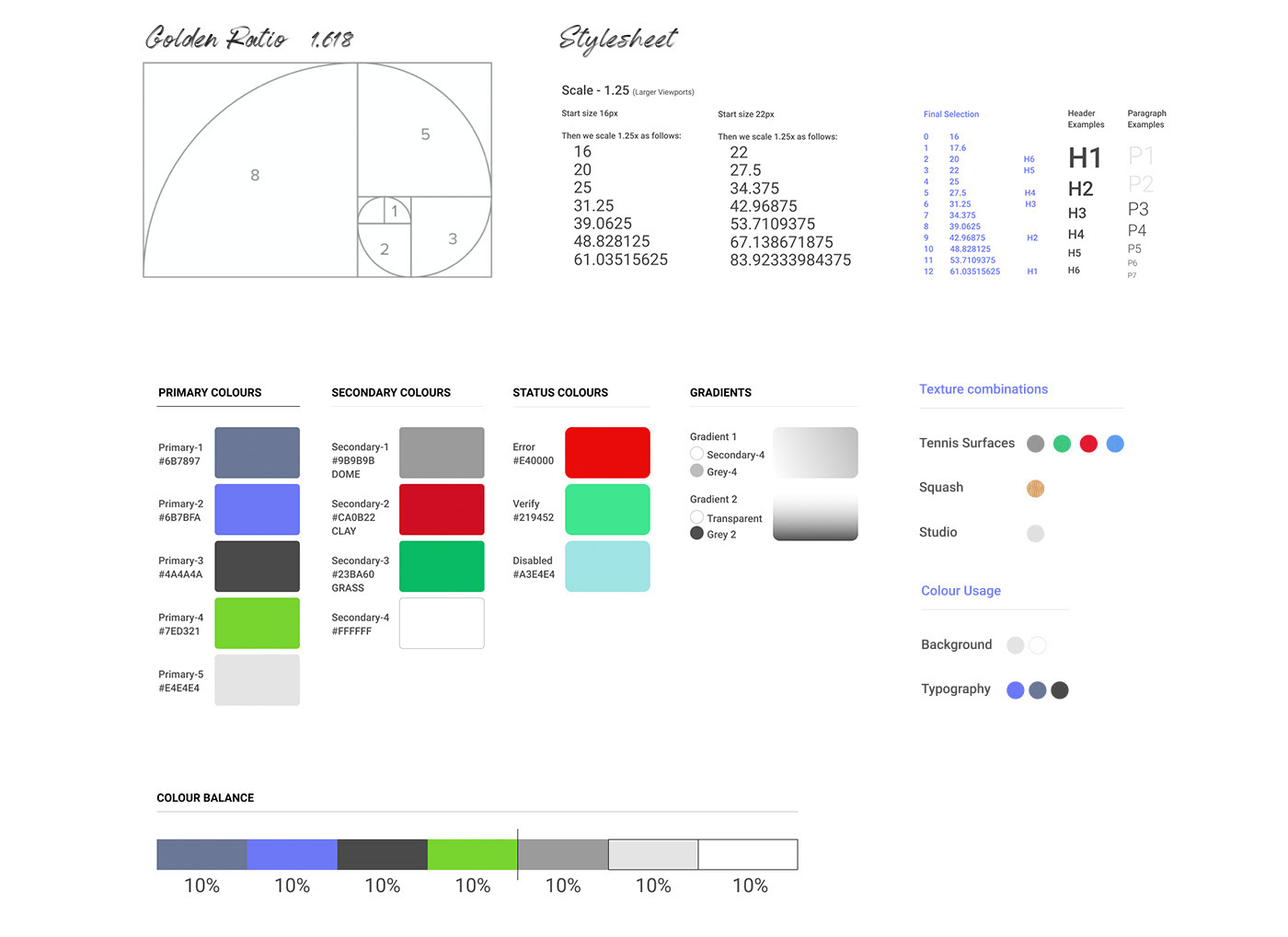
Controls, inputs fields, calendars, navigation and content components have been designed and from this app modules are built out. This not only helps simplify and speed up development but also when customizing the white label product with new branding and colours to reflect the business/club it is sold into.
I am currently working on this project in my spare time and have partnered with a fantastic tech lead, a React developer and junior dev. Domains are bought and design and development is under way. No clear or fixed timescales on when it will be completed as none of us are working on it full time but watch this space!
A rough prototype, quickly put together to demo to members and club staff helped spark interest.