
Unifying 20+ legacy design systems into the cohesive Litera Design System, following 17 serial acquisitions.
Background
Litera is a leading B2B SaaS company offering workflow and productivity solutions to law firms. The company is private equity-owned (Hg Capital) and has grown extensively over the past five years through a series of 17 acquisitions.
The series of acquisitions resulted in Litera having a portfolio of 28 core products, many of which were originally point solutions that solved narrow use cases in legal workflows.
The company’s strategic vision (and the thesis driving these acquisitions) was “creating seamless end-to-end experiences for lawyers and legal professionals, allowing them to be more efficient, create more value for their clients and enjoy their work more.”
Objective
I led my team to pitch, get buy-in for and manage the creation and implementation of the comprehensive Litera Design System, a critical foundation to the strategic vision of offering customers great end-to-end experiences.
My Role
As UX Manager, I identified the need and the urgency for this initiative; shaped the design system strategy; got buy-in and alignment from Product and Engineering stakeholders & leaders; led selection of the appropriate technology stack.
The Approach
1. Create a ‘burning platform’ (answering ‘Why’ and ‘Why now’)
Bringing together multiple acquired products into a single product portfolio highlighted a range of user experience issues with the legacy products and the vision of bringing them into a seamless portfolio, including:
- Inconsistent UI across the product portfolio: Different products often come with varying user interface designs.
- Greater user confusion and error rates caused by a patchwork of layout, design language, colour schemes, iconography, and interaction patterns.
- Reduced productivity as a result of inconsistencies that slow down users as they need time to adjust to each product UI.
- Increased Training Time and Costs: More diverse interfaces require more comprehensive training programs for users. This can increase the time and resources needed for effective training, adding to the overall cost of software deployment.
- Negative brand perception as a result of the inconsistent UIs of the disparate legacy of the products have been a constant reminder to users and customers regularly commenting that “Litera is a hodgepodge of acquired products duct taped together,” not the seamless experience the strategic vision was proclaiming.
Operationally, juggling countless design systems results in internal Litera operational and workflow inefficiencies, including:
- Reduced designer and development velocity caused by needing to work across 30+ legacy UI component libraries and design systems.
- Difficulty implementing universal updates across products, as each update must be tailored to fit different UI designs and technology stacks.
- Increased support queries triggered by users raising more support queries related to navigation and basic operations, putting additional strain on customer support resources.
2. Develop a design system strategy to socialize & pitch
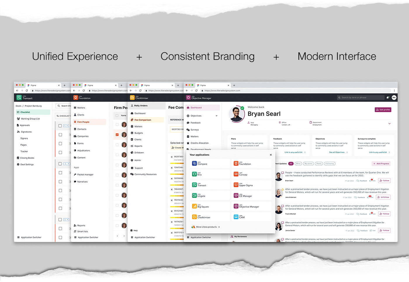
Above are some screens used to present and sell the strategy to the Litera leadership and the product organisation. I collaborated with many talented and wonderful colleagues in this journey and was fully supported throughout.
After approval from the Litera leadership & board we began building out this new design system. With our small design team, focused mainly on enhancements + new products, we decided to leverage an off-the-shelf solution. This enables us to accelerate the process from a design and development point of view.
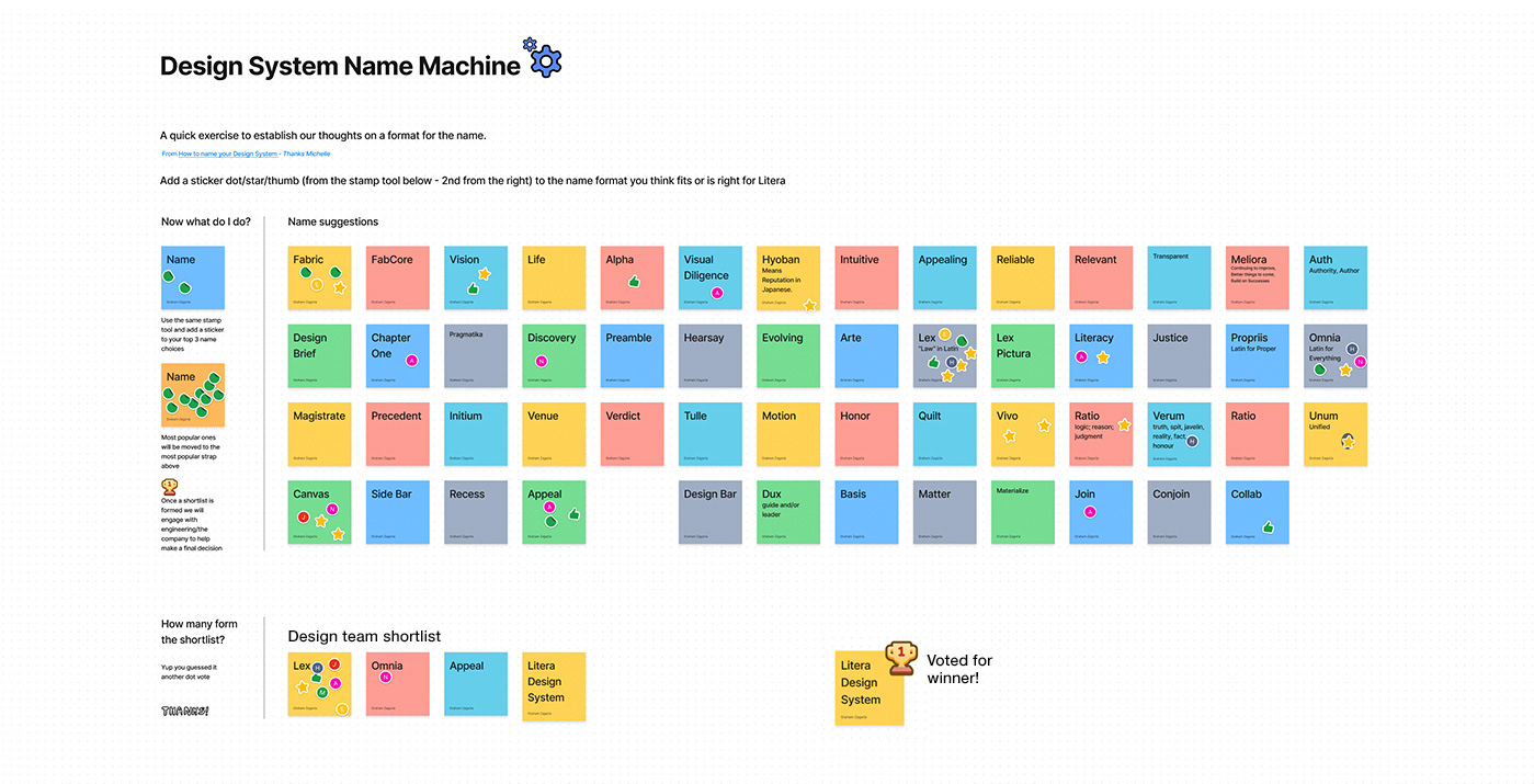
I engaged with multiple development leads to gain support, and we included the whole of the product organisation in a naming game where Litera Design System (LDS) was voted for.
3. Audit and understand the current state
Litera has setup a federated model with designers and developers from all parts of the business contributing to this internal product. Primarily a side of desk task for the designers we dedicated a two-week design sprint to define our north star, design vision for Litera products. Taking inspiration from other successful SaaS products we use and love as well as looking at existing published design systems.
During this design exercise the team generated over 3 million Figma frames, 60+ prototypes and 15+ projects. Maxing out memory usage on several Figma files.
The end results were presented to Litera leadership who all loved the new designs and direction confirming their commitment to growing the design team and improving usability & design at Litera.
4. Identify and empower a cross-functional team
I setup a Design System Guild with two experienced designers and our LDS engineering lead. Together we plan our team sprints and strategize this new internal product. I chair weekly full team rituals where we work on adding new components, organisms and pages to the backlog, QE built components in Storybook and talk all things LDS.
We have separate team meetings where we critique and review other UX design tasks. Being spread across the globe can make this challenging, we therefore also utilise asynchronous posting of short videos where designers present UX work. This is posted to a Teams channel for all to critique and offer feedback.
5. Documentation
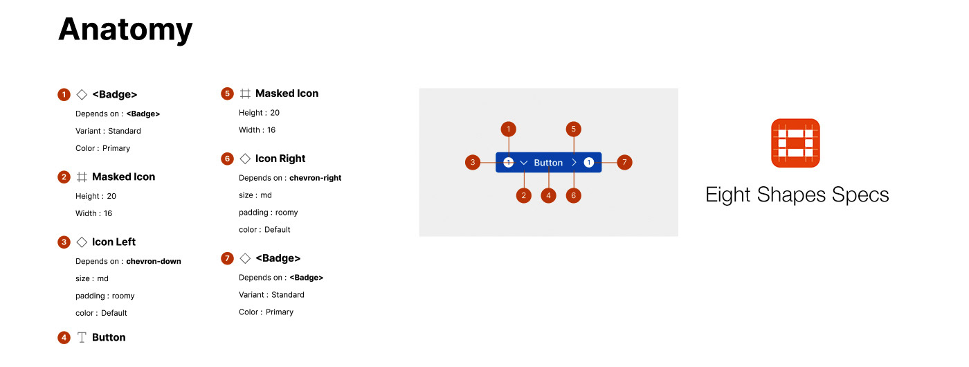
Documentation happens in Figma, Confluence and Storybook. We love Eight Shapes Specs plugin and use it for all our handover files providing dev's easy to read guidance. However our single source of truth is still in Storybook.
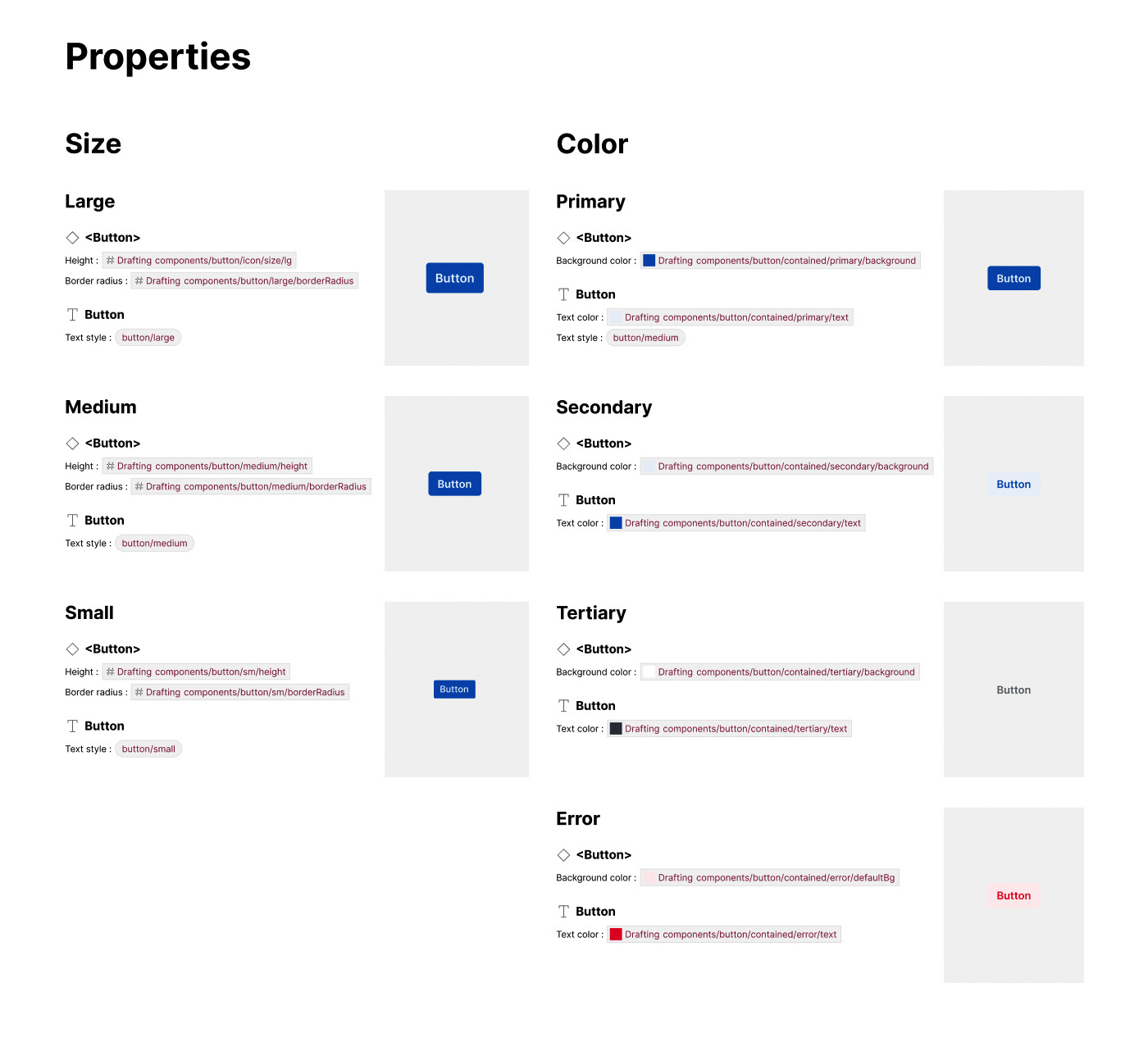
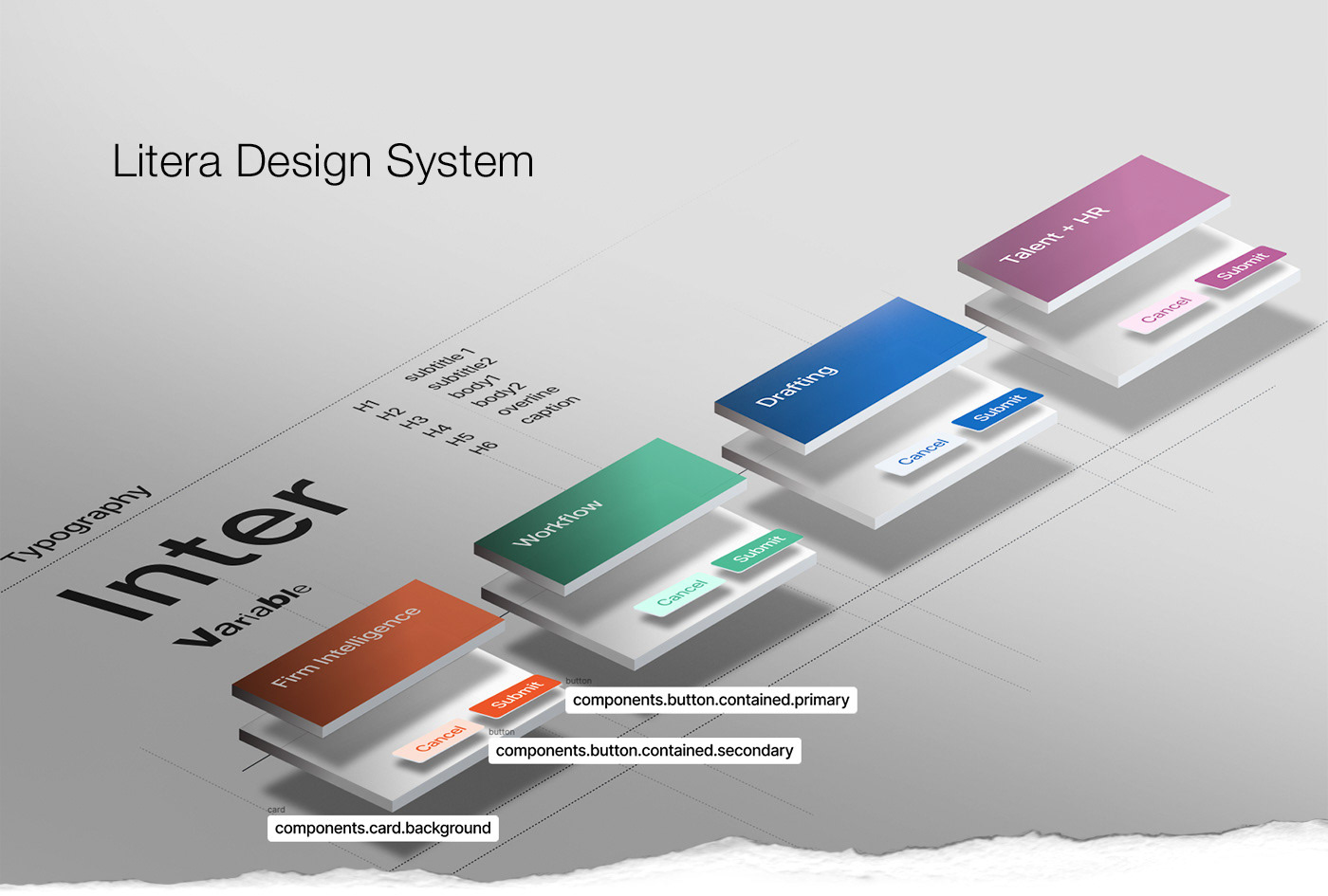
6. Tokens for flexibility
We have worked hard to update all core components to use token/variables which will allow us far greater design flexibility and make it far easier to apply multiple Litera themes to our system.
Tokens extend beyond just colour and includes: Typography font family + font weight + font scale + case + decoration, Spacing, Sizing, Border width + radius, Box shadow and More.
Litera's first product to use this new design system is a new Microsoft O365 add-in sitting in the Drafting product space. Primary & secondary colours will be updated to represent the different product areas that make up Litera.
Core colours were largely dictated by the marketing direction for the different product pillars, however certain colours were adjusted to be fully accessible and pass WCAG contrasts.
We love Token Studio Figma plugin and used it extensively to create and manage all of our extensive tokens within LDS. An early follower of this plugin I am part of the Into Design Systems community following their conferences and joining in chat on their Slack Channel.
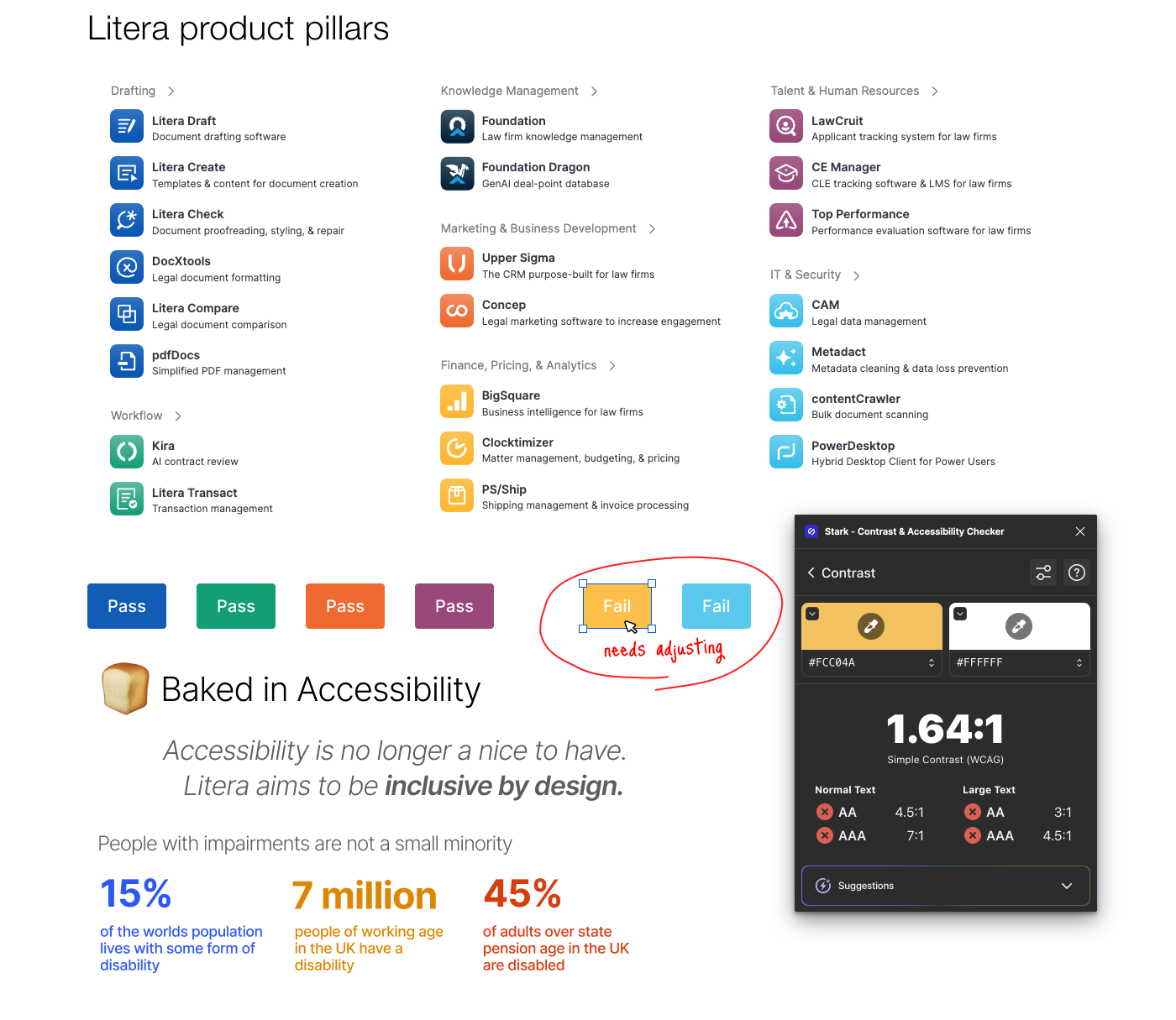
7. Accessibility
An important aspect of LDS is improving overall accessibility for the products it serves. In 2021 the market of people with disabilities was worth £212bn in the UK alone. (Known as the Purple Pound). Accessibility is about serving a wide range of disabilities many of which are temporary impairments. This inclusive approach goes a long way to fostering a sense of belonging and inclusion. Building community within the products that are being used. The benefits and guidelines for accessibility aligns with many design objectives of Litera's design system strategy:
Simple well designed typography. Introduce strong SCALE + weight rules.
Breathing space around elements. Strict information hierarchy. Strip back noise!
Breathing space around elements. Strict information hierarchy. Strip back noise!
Simplify user journeys + process flows. Way-finding and consistent positioning.
Intuitive, simple, clear and plain language.
Intuitive, simple, clear and plain language.
The system itself contributes well to deliver a more accessible and consistent product that is easier to use.
The Litera Design System as a product
As a lead UX manager much of my role was to evangelise and advocate for the use of LDS. If we didn't achieve 100% adoption we would have failed. Treating LDS as a product itself was critical. With a development leads and our design team we published a playbook communicating the various processes for developing LDS. This involved discovery, design, documentation, development, QE and deployment. Replicating standard product development practices was key with agile methodology applied to the process.
I have no doubt that LDS will be a huge success and enable Litera to ship faster, more consistent products that users will love.
The journey continues...